Page 1
revue de l'art actuel cinquième série numéro 6 juillet-août-septembre 1958 ES S M A I ####### C
Premières pages de l'ouvrage, en accès libre.
revue de l'art actuel cinquième série numéro 6 juillet-août-septembre 1958 ES S M A I ####### C
Galerie Rive Droite 23, Faubourg Saint-Honoré, Paris. Anjou 02-28 En permanence : - Mathieu - Sam Francis - Fautrier Œuvres de : - Leonor Fini - Gottlieb - Jasper Johns - Max Ernst - Wols - Tobey - Hartung --- Galerie Jacques Massol 12 rue La Boétie, Paris 8, Anjou 93-65 Busse, Clerté, Cortot, Dmitrienko J. Dufresne, Gastaud, Germain Lagage, Maisonseul, Mannoni Mogens Andersen, Ravel Key Sato. du 16 octobre au 15 novembre --- Lucien Durand 19 rue Mazarine Paris 6 Danton 25-35 Tajiri sculptures octobre
Galerie Breteau 70, rue Bonaparte, Paris 6, Danton 40-96 Expressions actuelles du 3 au 20 octobre --- Galerie La Roue 16 rue Grégoire-de-Tours, Paris 6, Odéon 46-70 Ideo Pantaleoni peintures du 1 au 15 octobre --- Galerie Ariel 1 avenue de Messine, Paris 8, Car. 13-09 Bissière, Bitran, Deyrolle, Doucet, Duault, Duthoo, Gillet, Goetz, Hartung, Manessier, Maryan, Poliakoff, Pouget, Singier, Tal Coat, Vieira da Silva. --- Galerie Arnaud 34 rue du Four, Paris 6, Littré 40-26 Oscar Gauthier peintures du 30 octobre au 25 novembre en permanence Barré, H.A. Bertrand, Carrade, Coppel, Downing Feito, Fichet, Gauthier, Guitet, Koenig, Panafieu F. S. Tanaka sculptures de Marta Pan
Howard wise gallery of present day painting 1132 euclid avenue cleveland ohio u. s. a. Carrade, Fichet, Feito, Downing Gauthier, Guitet, Koenig, F. S. Tanaka octobre-novembre --- Galerie La Cour d'Ingres 17 quai Voltaire (dans la cour), Paris 7, Lit. 80-48 Laloy exposition présentée par André Breton du 7 au 28 octobre --- Unique au Monde Le seul Répertoire International : Musées avec leurs Directeurs et Départements Antiquaires, Galeries d'Art, Métiers d'Art Editions d'Art, Librairies Anciennes et d'Art Hôtels des Ventes Bibliothèques et Archives Publiques Académies d'Art, etc. DU MONDE ENTIER. Une documentation unique sur l'Art : 70.000 adresses par ordre alphabétique, par pays, avec spécialités et 1.000 illustrations Annuaire International des Beaux-Arts Internationales Kunstadressbuch / Anuario Internacional de las Artes International Directory of Arts Edition 1958-1959 En vente : à partir de l'été 1958 chez les libraires Prix en souscription : 3.000 frcs — Après publication : 4.000 frcs International Directory of Arts, 6 Dessauer Str., Berlin-S.W. 61, Allemagne Revue internationale d'art moderne QUADRUM la grande revue internationale d'art moderne publiée au Palais des Beaux-Arts de Bruxelles. Quadrum 4 Extrait du sommaire : C. G. Argan : La crisi di valori Adrian Stokes : Form in art La 3ème Biennale de Sao Paulo L. Kochnitzky : Marc Tobey R. V. Gindertael : Bissière M. Bilke : Servranckx Fitzsimmons : Jean Dubuffet A. Ehrenzweig : Victor Pasmore's Architectural Constructions G. Mazzariol: Cronaca di un Linguaggio, E. Vedova F. Mathey : Le vitrail moderne en France H. Seiler : Vier West-deutsche Privatsammlungen Documentation : Jeunes artistes, miscellanea, livres, expositions etc... 15 planches en couleurs, plus de 150 reprod. en noir
Dusanne Gallery 1303 Lakeview Place, Seattle Washington --- John Koenig september 4 to 21 --- Galerie Apollinaire Via Brera 4, Milano Tel. 862821 peinture italienne et étrangère d'avant-garde en exclusivité pour l'Italie : Fautrier, Hartung, Schneider, Bryen, Licini, Soldati, Meloni Helman, Laubiès, Bellegarde, Feito, Koenig, Duque, Brüning, Hundertwasser, Berrocal (sculpteur) --- Howard wise gallery of present day painting 1132 euclid avenue cleveland ohio u.s.a. --- EXHIBITIONS - AUTUMN 1958 JOAN MIRO - GRAPHICS XAVIER GONZALEZ - RECENT PAINTINGS AND SCULPTURE HENRI-GEORGES ADAM - GRAPHICS PIERRE SOULAGES - PAINTINGS AND GRAPHICS SURVEY OF CONTEMPORARY ENGLISH PAINTING EIGHT YONG PAINTERS OF THE GALERIE ARNAUD - PARIS --- Iris Clert 3 rue des Beaux-Arts, Paris 6, Danton 44-76 The most advanced art gallery in the world --- Galerie Franck Frankfurt-Main, Vilbelerstr. 29 --- Lückeroth peintures september 1958 ---
Cimaise revue de l'art actuel 34 rue du Four, Paris 6 Directeur : J.R. Arnaud Secrétaire général : John Koenig Rédaction : G. Boudaille, M. Ragon, P. Restany Herta Wescher La rédaction reçoit sur rendez-vous Abonnement (6 numéros) 1.600 frs - Par avion : 2.800 frs 34, rue du Four, Paris 6, téléphone Littré 40-26 C.C.P. Paris 5542.39 Diffusion : Allemagne : Librairie Hanna Weber, H.-J. Niepel, Dusseldorf 1, Grabenstrasse 11 Argentine : Editorial Victor Leru, Cangallo 2233, Buenos-Aires Autriche : Arnulf Neuwirth, Paracelsusgasse 8, Vienne 3 Belgique : Jean Milo, 28 rue de l’Arbre Bénit, Bruxelles C.C.P. Jean Milo, Bruxelles 1591.50 Italie : Le Noci, Via Brera 4, Milan Danemark : Meiners Kunstforlag, Peder Skramsgade 5, Copenhagen Grande-Bretagne : Alec Tiranti Ltd, 72 Charlotte Street, London W 1 Japon : Meiji-Shobo, Surugadai, Kanda Tokyo Norvège : J.W. Cappelen, Sortimentebokhandel, Oslo Suède : Eric H. Olson, Upplandsgatan 3, Stockholm, 10 23 77 Suisse : E. Genton, « L’Entr’acte », rue du Lion d’or 4, Lausanne, C.C.P. II 144-56 U.S.A. : Wittenborn and Co, 1018 Madison Ave, New-York 21 --- Sommaire Couverture de Mathieu Textes anglais 7 The Venice Biennale by Herta Wescher 9 Estève by Georges Boudaille Textes français 11 La Biennale de Venise par Herta Wescher 19 Estève par Georges Boudaille 29 Tendances actuelles par Herta Wescher 39 Belgique année 1958 par Michel Ragon 41 Les expositions à Paris par Georges Boudaille, Michel Ragon, Pierre Restany, Herta Wescher 49 Texte anglais (fin) --- A NOS LECTEURS Avec ce numéro 6 de la V° Série s’achève la cinquième année de Cimaise. Pour la majorité de nos abonnés, leur abonnement se termine avec ce numéro. Nous leur demandons, afin de bénéficier de l’ancien tarif (1 an - 1600 frs) de bien vouloir nous adresser leur souscription avant le 1er novembre, date à laquelle le prix de l’abonnement sera porté à 2000 frs, celui du numéro à 380 frs ; cette majoration nous étant malheureusement imposée par l’augmentation de notre prix de revient. Tout règlement (1 an : 6 numéros - 1600 frs jusqu’au 1er Novembre, 2000 frs après cette date) peut être effectué par chèque ban- caire ou par versement au nom de CIMAISE C.C.P. Paris 5542 39
English translation by J. F. Koenig The Venice Biennale by Herta Wescher This year’s Biennial has left us different sorts of souvenirs: the contrast between the few lively pavilions along side of the boring academic ones, and the general feeling of stupefaction caused by the way the Grand Prizes were distributed. But the most disheartening impression for the French visitors came from the slow but steady disappearance of France, whose responsible authorities seem to disown the young and vivacious Paris School that could and should be gloriously shown here, instead of defending, without the slightest risk, certain tendencies that are out-of-date. No one in Venice ever mentioned what was shown here. The visitors in Venice who are anxious to discover the symptoms of some forward evolution, have already become accustomed to find nothing in the French Pavilion. The room where the most retrograde type of painting such as that of Legueult was found, was a mockery; no one stopped in front of Masson’s painting, that seemed to be nourished by things borrowed from the younger painters that were not found here; Pignon’s qualities were slighted, but if they had been presented in a better fashion, they might well have held attention. The exposition of Braque was not better chosen, too much centered around the paintings of the last twenty years; only a few canvases of the period 1947-49 stood out; the cubist period was represented with only one fine still life of 1911. (As to the room that was consecrated to the sculptures and the graphic works, it was not as yet visible at the end of the period reserved for the critics.) If this stagnant atmosphere that is found in the French Pavilion explains the reason for the lack of resonance around the exposition of Pevsner, other intangible reasons also seemed to have concurred in eliminating him from the selection for the Grand Prize, for which his historical rôle seemed to designate him. We were explained that a change in the regulations obliged the jury to give the Grand Prizes to the Italians. But the fact that the laurels were given to Mastroianni was highly criticized, for it gave his monotonous and heavy sculpture an importance that was by no means merited. Licini, the Grand Prize for painting, whose work is hardly known outside of Italy, met the same violent reaction. We can find here however a certain historical interest, since his painting finds its sources in the period between the two wars. Figurative motifs are written ironically over certain geometrical compositions in a Bauhaus style. The delicacy of the tracings, seconded by subtle colors, gives a discreet charm to his little paintings. Once the ceremony of the Grand Prizes was over, the impartial opinion of the jury expressed itself more clearly with the second prizes. The agreement was almost unanimous on Tobey, whose room was among the most impressive of the whole Biennial. His works, coming from 1935 up until today, revealed an inexhaustible imaginative richness, not only when he drew his structures, always in perpetual motion, from the outside world, but also when his meditative concentration was liberated by an uncontrolled automatic writing. In the evolution of this personal style, the piling-up of certain limited elements gives way to inextricable graphic treatments, and the vibrant surfaces stretch out into infinite space, while the few vivid colors disappear in waves of white lights. At the moment when the vogue of gigantic canvases spreads from America to Europe, this painting is striking because of its expressive denseness that emanates from even the smallest sized works. Nonetheless, on the other side, Rothko’s painting justly imposed itself by the largeness of its form and its content. All of its magic resided in the intensity of the colors that, rising and falling, became a moving force that shook the static order of the large geometrical plane areas on which the compositions are based; these unsubstantial cubes seem to float in the luminous ether, in the kingdom of the spiritual powers. We might also mention, along with these two Americans, Okada, a Japanese, whose painting took form in New York, and who has an important place there. (UNESCO prize and Astore Meyer prize) This is an amiable tye of painting that doesn’t like to make precise and authoritative statements. Light and somber areas slide one behind the other, and some lines prudently intervene in the serene interplay of lights and contours. The two sculptors that occupied the other rooms in the American Pavilion, are just as opposite as the two painters. Lipton is inspired by vegetal forms, that remind us of corollas that open and close, leaves that unfold and unroll, that give birth, through a mysterious transmutation, to ambiguous beings, vegetal men, or human plants, coming from the same universal family. The refined patinas, made of an alloy of nickel and silver, with their changing colors, give the sculptures an attire that is almost too precious. On the contrary, the mechanical age can be found in the sober works of David Hare, where fragments of machines, picked up or invented, are erected into ghostly monuments, in naked steel or varnished with color. If it is exact that Tapiès lacked a single vote to have received the 2nd Grand Prize for painting (he nonetheless won two others: from the David E. Bright Foundation and a UNESCO prize), the fact that Chillida won the sculpture prize seemed to show before all the jury’s desire to distinguish the Spanish Pavilion that actually gave one of the biggest surprises in the Biennial. The man that organized it, the Director General of Cultural Relations at the Ministry of Foreign Relations, dedicated it entirely to the artists of the young generation, thus giving them considerable aid. Chillida’s laurels, however, seem to us a bit premature, for this young sculptor has only recently succeeded in liberating himself from diverse influences. In his forged iron sculptures, certain works made up of strict elements, seem to form large signals of alarm, and then along side them we find others, more complicated and more secret. But it is with the very recent bronzes with their compositions in simple plane forms that thrust themselves audaciously out into space, that we are shown the new and personal way that Chillida will take from now on, and that justify the credit given to him today. Among the Spanish painters, Tapiès seems the most affirmed personality. His compositions with their large areas and heavy matter are live with a strange enchanting force, suggesting windows that are closed to the universe, or age-old prophetic epitaphs. The catalog classifies this ensemble of abstract painting into different currents: dramatic, romantic, geometrical; but in reality, these currents cross or mingle, and the more vigorous tendencies dominate over the more moderate ones. The vehement writing of the brushwork running with liquid colors found in Saura’s painting, stiffens in the work of Turcios or Vela into thick pastes and swollen surfaces. Cuixart composes relief-paintings with metallic patinas, marked with assembled structures into an ordered framework, or into moon-casters that burst forth in a haphazard manner. Beside these works with their excessive expression, Feito’s painting touches us by its silent discretion. A poetic note comes forth from these matter-forms that group together or fade away, like clouds in a calm or stormy sky, but always a somber one. In Canogar’s mature works, certain crusted surfaces, certain nervous tracings come forth from the empty spaces in neutral tones where sometimes vivid colors cut through. In Burri’s fashion, Millares introduces into his painting rags of canvas, basted by cords, plastered with white glazes, splattered with inks, that dramatize his effects to an excessive degree. We rest a bit in front of Rivera’s object-paintings, that are kinds of living and transparent engravings, made up of woven stamen, with their textures sometimes loose, sometimes tight, superposed and suspended in a network of thin wires. If the Spanish Pavilion gives us a glance at the present-day evotion in this country, with all of its diversity, without necessarily persuading us of the qualities of each artist that is shown, the German Pavilion does the same in giving us nine painters and two sculptors, showing those who determine the multiform aspects of today’s art. But whereas the abstract painting of the young Spaniards (who are for the most part between 30 and 40 years old) seems animated with the same passionate spirit,
or mystical faith, in the old Iberic tradition, that lives again under austere or extatic aspects, the German group has gathered together painters of all ages, showing us the most varied of temperaments, with all of the painters quite conscious of their means of expression. Jules Bissier presides over this group like a Grand Master; in his India ink drawings, that over the long years have kept their freshness, the message of the calligraphic signs has recently been enriched by the use of more complex relations between the forms. Graphic writing is also the basis for Goetz’ and Sonderborg’s paintings; both of them confide themselves to spontaneous inspiration brought about by an attentive concentration. Sonderborg’s highly explosive dynamism has slowed down in the most recent canvases giving more continous movements and cut-off curves that cover all of the surface. A similar evolution can be seen in Thieler’s works: the particles that formerly dispersed themselves in space now contract and condense in indistinct contours, mirroring their images through colored facets. In contrast to this, Wessel’s themes are composed of large elements in vague forms but of compact substances, covered over with finely porous and frosty textures, destined to the embellishment of a disjointed world, criss-crossed by lost tracks. And in a soil of clay and chalk, deserted and dreary, but pointed with gleams of color, Schumacher inscribes his fleeting, and strangely eloquent tracings. At the end of the German Pavilion, Kandinsky occupies a place that corresponds to his historical importance; it is he who sowed the seed of the present-day evolution seen in the other rooms. The paintings of the Gabriele Muenter Grant, lent by the Municipal Museum of Munich, gives a grandiose idea of the track that Kandinsky broke open in the years preceding the other war: his creative will broke away from all of the restrictions that the reproduction or the transposition of the outside world inflicted on art, and his triumphant color brought about an explosion of form and line. Whereas Kandinsky, the Russian, has a place in the German Pavilion, Wols, the German, is to be found elsewhere, in the Grand Palace; as the direct forerunner of the most recent turning-point, his rooms have become a pilgrimage for his admirers, who rarely have the chance to see so many of his paintings grouped together. However, those who are not blinded by the steadily growing Wolsian myth can see that the number of works that justify this veneration can be limited to a few canvases of the few years that precede his death. Two opposing tendencies can be found here; one that gathers together forms and lines into images of heads, flowers and birds; the other obeys his need of expression through any kind of manner, strongly scorning all pretense of the virtues of order and discipline. In these canvases, the minute and exact drawings of the earlier water-colors have been sacrificed for gratuitous scrawlings, the graceful colors replaced by shocking ones, or even more often by soiled and dirty tones, in the midst of which certain reds come forth like spots of blood, underlining the derisive character of this painting, that since this time has gained numerous disciples. But evidently, there are none of them in Switzerland. During the last Biennial, its Pavilion distinguished itself by the rich and objective choice made in the sculptures that were shown; this time, the paintings shown give a clear preference for the most rigorous type of geometrical painting. The ensemble is dominated by the generation that was born at the end of the other century—Leuppi, Graeser, Bally, Glarner, etc.—that stay in their position without the slightest concession to the more supple and anti-dogmatic spirit of today, seen in the water-colors of the veteran Moilliet, even though they were done before 1935. Among the younger painters, Terbois and Philippe follow their elders but do not surpass them because of any new evolution. The few painters of a freer style that were seen seem to have been shown only because of the bad conscience of the organizers. Only the canvases of Eble, with their airy construction in plane areas and lines, shaken by the wind and pierced with light, were shown in a decent manner. Moser and Barth, on the contrary, take on the role of prodigal sons who have too daringly crossed the frontiers of their native country to find here their proper resonance. The atmosphere of this pavilion isn’t even suitable to Bill’s sculpture, underlining to an excessive degree its spirit of research. For although the basic elements of the constructions are of clearly mathematical order, the accomplished work shows that the incalculable dominates the calculable. The 22 sculptures shown, done during the last twenty years, turn around the same problem of the relation of the form to the surrounding space; but in their chronological order, the tendencies toward simplification and amplification are carried forth at the same time. On one side, the constructions of multiple elements, with their skillful measure and proportion are followed by others with only a few sides, joined together in sharp angles; on the other hand the continuous motion that was utilized for the first time with his classical “Ribbon without end”, has since then found many rich variations, with broken and interlaced curves. If the small models with their shining surfaces in brass or gilded copper give us an incomparable formal pureness, the true sense of this sculpture can only be seized in the monumental works—the weightless monumentalism that is specific of our century—that have been placed outdoors, where their internal rhythms are prolonged into infinity. The paths recently taken by sculpture are shown in a very characteristic manner with the work of Hajek, in the German Pavilion. He calls these highly rhythmic compositions, with their distinctly expressive intentions, “spatial knots”. Architectural forms hide behind demolished façades; they seem to be portals or arcades overgrown by virgin forests, with stalactites formed around the abandoned frameworks; thus we have organized structures that play upon the effect of the modeled and hammered matter clinging to them. The hopes that were formed around the development of young English sculpture have withered since the return to a figurative expression, tainted with romanticism, has taken over. In the same proportion that Armitage’s older works, such as “Seated group listening to music”, pleased us, his new evolution shown with his “Women lying on their side” leave us dubious. Whereas the group compositions with the figures closed in by vertical or leaning walls recalled human existence with its fatal constraints, the significance of the lone figures with their exalted gesticulations seems lessened. Of the two rooms in the English Pavilion that were reserved to Hayter’s work one for the engravings, and the other for the recent paintings—it’s the first room that is the most important. Actually, the means of expression par excellence of this artist is the burin, and he has developed an idiom of unknown richness with it. To the flexible tracings of the lines, going from the decided and energetic strokes to the melodious and cursive interlacings, are added infinite nuances of white and black. The figurative subjects show themselves as eloquent as the purely emotional themes. But this personal style risks to be lost in his recent large paintings, invaded by movements that are mixed up in the scramble of the fading shapes and the dimmed colors. Persevering in the presentation of figurative art, the English Pavilion also shows us the sympathetic painting of William Scott. His still lifes are composed of simple objects, isolated on large surfaces, but allied by the dense tonalities of the colors. The perspective seems to obstruct the space, and brings the objects towards us in a head-on view, giving a strange sort of presence to them. The confrontation of figurative and non-figurative artists shows that the Yougoslavs are courageous; their pavilion distinguishes itself by the good choice of three painters and two sculptors. Tsars’s sculpture groups men into serried ranks, linking it formally with that of Armitage, but instead of being impregnated with a sense of tragedy, we find an optimistic spirit of solidarity in these demonstrators that march along, their groups forming a star. Olga Jevrie’s projects for monuments, on the contrary, with their large clods of cement that are suspended in space by
iron rids, evoke less comforting visions, seeming to be frameworks of buildings that remain after an earthquake. Among the painters, the strongest personalities can be found among the figurative painters, especially with Stupica who attracts us through his highly poetical imagination. Personages and objects are hidden in a fairy-tale atmosphere that is both naive and marvelous. Children’s toys, pedlar’s wares, the things found in the artist’s workshop, are spread out in planimetric order, without any texture, and the intense and gleaming colors contribute in intensifying the sense of irreality. On the contrary, Hegedusic’s painting is of a social-realist type; but for him the “Best of All the Worlds” is moreso a great void, where people with their little joys and cares take on startling proportions. In this disenchanted world, another painter, Mutic finds refuge in a nebulous cosmos, that he gilds with the magic potions of his palette. While we are speaking of figurative art, let me mention the triptych of Arbon, dedicated “To the memory of the Victims”, that is the pride of the Pavilion of Israel. This painter takes all sorts of different and even contradictory elements and mingles them perfectly together. His compositions are based on geometrical relations—remembrances of his studies at the Bauhaus—but they are placed in dream landscapes, glowing with color. His subjects, brutally up-to-date, such as “Battle Field” or “Traps”, are told to us in a folk-tale style, clothed with symbolicals forms, whose meanings escape us. In examining the other pavilions in order to at least take note of them, we might be able to give a “Rather good” to the Polish Pavilion, although it is less lively than that of two years ago; and a “Fair” for the Dutch and the Austrians, where Klimt has a certain historical interest. But we are forced to refuse completely the Canadians as well as the Russians, for their show of reactionary tendencies, as shameful for the former as for the latter. We must be more attentive in our choice in the Grand Palace, where the 50 rooms give an exceptional chance to the Italian artists. But we quickly realize the risks for the young artist, especially in these one-man shows where the numerous canvases only too quickly reveal the “manner” of the artist rather than his personal talents. This is the case, for example, of two Venitian painters, Breddo and Bacci: the latter’s colorful dynamics, that is striking at first, becomes quite garish on seeing more. With Breddi, whose canvases have as a characteristic their sensitive tone values, when you take them one by one you find that there is a certain lack of strength. On the contrary, the three works of Burri that were chosen, show again his intense strength, animated by the materials that belong to him: gunny sacks, burnt boards, etc., that oppose themselves to the almost invisible structures of his “All Whites”. For sculpture, the three rooms that were reserved to Franchini, Signori and Cappello, suffered because the works were so crowded together, that it stifled their radiance, and underlined the weaknesses to be found in each of their styles; the internal void hidden within the simple and unadorned volumes of Signori’s work; the too elegant manners of the animated contours of Cappello’s bronzes; and the over-symbolic expression that overlaps the spiny sculptures of Franchina. On the contrary, Fontana has so much space that his “spatial concepts”, in plaster or plastics, with their closed forms or open movements, don’t succeed in filling the space, because of their lack of tension or internal radiance. Without cease trying out new experiments, that are supposed to bring about the multiplications of present-day means of expression, Fontana offers us propositions moreso than valid solutions. His spectacular reliefs please us less than Milani’s “mural plastics”, made of a mixture of plaster, sand and cement, that hide in their relief vague silhouettes of figurines. Like him, Mario Nigro looks for abstract forms capable of suggesting human subjects, and faces and bodies, appearing through volumes in multiple planes, with their torn contours, and gaining our favor by the sincerity of the experiences expressed here. The most successful innovation of the Biennial was to have given 10 rooms in the Grand Palace to “Young Italian and Foreign Painters” that defend the most varied kinds of ideas. And this international encounter reveals itself as being extremely lively, even if a part of the propositions put forth here are questionable. The Italian group is made up of painters of certain merit such as Perilli, with his illegible diagrams cut into the wide surfaces; or Ruggeri, rendering his subjects mysterious by the violent interlacings of the lines that goes on in the space opening out from the compact walls of color; or the young Saroni, whose painting is both emotional and ordered. With the Americans, Joan Mitchell’s informal writing with its vivid colors is placed opposite the ultra-geometrical compositions, brought to the limits of irony, of Jasper Johns. England gave us Sandra Blow, who imposes herself by her vigorous temperament, and Alan Davie, who intrigues us by his mysterious imagination. In this ensemble of works, Arnal, with his large painting in heavy biomorphological forms, is the only representative of the School of Paris—for we cannot include Commère’s and Rebeyrolle’s figurative painting in this nomenclature, even though, in their style, they are rather good; Bertini, with his three impressive paintings of his peculiar vision, should have been with the Italians, since Moser showed in the Suisse Pavilion, and Tapiès was with the Spanish. Summing things up, the young Spanish painting seems to have been admired, and the German evolution has been noted, but the School of Paris continues to be ignored, even though the other schools have taken their nourishment at its fountainhead. Let us hope that the next Biennial will give us 4 or 5 rooms in the Grand Palace and we will show all of the richness and vitality of the School of Paris, around whose existence the silence must be broken. Herta Wescher Estève by Georges Boudaille Already twenty years ago, Estève had taken his place in the history of contemporary French painting. His work is known, and its interest is widely recognized; he is always invited to all of the great artistic manifestations. Nonetheless his style is often questioned, and remains abstruse and perhaps not fully comprehended outside of the circle of his amateurs and his admirers. This is because Estève is a solitary man, and his work, following the artist’s character, has a singular style. The artists that are linked with some large artistic current, be it informal, geometrical, or otherwise, benefit in the critical exegesis having to do with the particular tendency. Originality or peculiarity always disturbs the spectator, who is naturally lazy, and inclined to like what he knows already rather than trying to find a way in the primeval forest. What is sometimes discouraging or disconcerting in Estève’s painting is its aspect of dense vegetation. All of the colors of the palette mingle together with a maximum intensity. The reds, the blues, the greens, the yellows, the browns, the oranges, the blacks and the whites are vigorously placed one aside the other in a noisy symphony. I know few contemporary painters whose palette is as varied. But soon our examination comes up against a psychological barrier. Each of Estève’s canvases is found to be well conceived yet locked up, and drawn in on itself like a hermit crab in the spiral realms of his shell. It is difficult to penetrate and it is often a task even to find the entrance. An “informal” canvas, in spite of the different esoteric comments that can be made about it, is nonetheless a kind of invitation for dreaming. On the other hand, geometrical construction offers its rational and logical organization for our admiration. With Estève, we find neither the one nor the other. If our imagination starts up when we see one of his canvases, it soon runs up against the too precise forms, the too violent colors that stop its élan, keeping it from wandering fancy-free. Estève’s painting is not like some others who resemble certain Spanish inns where you find… what you bring. And if you try to decompose the work’s organization, you run up against an architecture that is much too complex for the mind to be able to condense it into simple rhythms.
Thus, if it is easy and agreeable to speak about the artists that you understand and like already, the business of taking on an explicit commentary of Estève’s work seemed like a wager to me, but at the same time, because of the profound fascination that I have always felt in his presence, it was also an exciting exploration. And to repeat the metaphor that I have already used, I felt as if I was searching for paths hidden in an exuberant equatorial jungle. *** It’s useless to go back to Methuselah to place Estève’s work in the history of art. Not even back to the Renaissance. As to the pictorial revolutions that have followed one another in the last fifty years, their development is sufficiently well known to have to talk about them again. The idea of “justifying” Estève’s work seems just about as superfluous to me. It has its own particular resonance, for that matter, merely from the fact that it developed, if not completely cut off from the main currents, at least on their edges, or perhaps parallel to them, and with his own personal hesitations, and his backward glances; and while he did not always ignore certain false problems, for the most part he refused them: for example, the opposition in the supposedly unsolvable problem of abstraction-figuration. According to my way of thinking, the best introduction to Estève’s present style is nonetheless to be given by the complete history of his work. However, as deeply steeped in Taine’s theory as we might be, we must admit that neither his heredity nor his social milieu bring any appreciable explanations about the painter’s development. Estève was born in 1904, at Culan, in the département of the Cher, where his grandparents lived, but this gives us no indication, for both of his parents were Parisians. These are all the details that this modest and reserved man told me about his identity. According to him, everyday happenings have no direct influence on his work. He has an inherent and systematical refusal of the picturesque details that so many use for their publicity. Estève only wants you to consider the painter. I will nonetheless note for the use of future historians, who may be more shrewd than I, the fact that his father was a shoemaker and his mother was a dress-designer for the haute-couture. What is certain is that while still a child, he already showed his calling as a painter, followed up by his wish to continue his studies in the School of Fine Arts. His father’s opposition only strengthened his determination. Since this time, he always feels that to have a brush in his hand is like seeing a Promised Land, where the vice of painting (almost) always goes unpunished. Estève had to earn his living by designing furniture, but didn’t give up his drawing or his painting because of this. We have from this period a small landscape in a somewhat Impressionistic style that is dated 1919, that he has jealously kept. Also he has a certain number of canvases that remain from the period 1922-27. During this first period, there is only one interruption, that takes place in 1923, a year that he passed in Barcelona, favored by other pleasures of existence than painting. In 1927, he showed for the first time at the Salon des Indépendents, and after this showed regularly at the Surindépendents. 1930 was the year of his first one-man show and his first sale, but it is only in 1941 that he will be able to dedicate himself completely to painting. This year he showed in many places: at the Galerie de Friedland where for the first time several painters that were to become well-known were found together—Lapicque, Bazaine, Gischia, Tal Coat, and Pignon; and also at the Galerie de France. In 1942, he joined the Galerie Louis Carré, where he had an exclusive contract until 1948; he had, that year, an important show of his works going from 1937 until 1947. In 1952, the Kunsthalle in Bern gave him two rooms to show his old and recent works. In 1956, the Royal Museum of Fine Arts in Copenhagen organized a big retrospective show of works from 1929 until 1956. And finally, he showed at the Villand-Galanis Galerie in 1955, 1956, and 1958. But this is only a list of names and dates. What counts for Estève is the silence and solitude that will allow him to follow the subtle existence of forms and colors on the canvas. Even the enthusiasm and liveliness that were brought about by the big decorative works that he did along with Robert Delaunay, for the International Exposition of 1937, left no mark on his work. He knew Delaunay, but only a bit, and this didn’t change anything. Outside happenings bring no immediate reactions in his painting. They undergo a distillation, and an internal ripening before they come back to the surface of consciousness, if they ever do appear again. The same thing can be said of his contact with masterpieces, and famous artists. And yet Estève has studied extensively paintings in museums, but we can find no trace or influence. And although in 1942 he painted a “Homage to Cézanne” and ten years later did a “Homage to Jean Fouquet”, the things that link him with these masters are far too subtle, and it is easier to find their traces in a certain quality of his paint, or in the color or the light, rather than through some kind of common inspiration. To show the degree of “silence” that Estève needs around him, let me state that he not only banishes all of the disturbing echoes of everyday life, but also that he yields his admiration to his famous elders only after long deliberation. Picasso caused him many “shocks” in his youth, but since then all his emotion has vanished, leaving only his astonishment for Picasso’s exceptional talents. Estève is attracted much more by the colorists that are at the same time draftsmen who know how to render a form “abstract”; he admires Matisse, and especially Léger, who he places at the peak of the artists of our century. Léger knows how to make a woman’s effigy a symbolic form. It is similar to the feeling we have in admiring the Virgin by Jean Fouquet: it is not the perfection of her breast that moves us, but the splendor of the circle in all of its pureness. Once this is explained, I would like to try to show the successive steps in the maturation of his work. In his first canvases, and notably in the sleeping peasant woman that is reproduced, we can already find some of the forms and rhythms that we will find again later, that keep coming back, like artistic constants. What can we draw from this? Only that even very early Estève had already discovered, certainly unconsciously, the formal symbols that would not allow us to identify the creator, but would make concrete a particular aspect of his character and his disposition. These forms however are found rarely in the canvases prior to 1929, that are the fruits of his apprenticeship. It is in 1929 that he seems to become aware of the possibilities of painting, and puts himself to experimenting and exploring the different paths that open to him during his investigation. Thus he followed the track of synthetic Cubism with his “Reading Woman” of 1929, and lingered in the game of flat areas and silhouettes in Léger’s manner, but in a more elegant and more symbolic manner, in a way that seems to anticipate some of Gischia’s paintings. Other old canvases give us glimpses of rupestrine-like figures of a rather disconcerting primitivistic style. In spite of the diversity of the different works, and their relative degrees of importance, we can see in all of them a constant preoccupation for the problems of space, a great facility with the linear rhythms, and a rather flippant and brutal manner as concerns the chromatic harmonies. Dissonant nuances periodically succeed these systematic and violent contrasts. But we must remember that this is a period of experimentation that Estève will not take up again except during 1941-43, when he will feel the need to return towards a highly colored reality. From 1935 on Estève gave his first tangible and finished proofs of his talent with a series of canvases that were extremely architectural, with blue and red as dominant colors, where the arabesque of human silhouettes is mixed into dense and solid rhythms, whose stability and maturity are still astounding. Estève was thirty at this time. He already possessed a powerful
La Biennale de Venise par Herta Wescher La Biennale de cette année a laissé des souvenirs mélangés : contraste de quelques pavillons très animés à côté de ceux où règne un ennui académique, et la stupéfaction générale qu'a provoquée la distribution des grands prix. Mais l'impression la plus déprimante pour les Français provient de l'effacement lent et sûr de la France, dont les autorités responsables paraissent renier par principe la jeune et vivace Ecole de Paris qui pourrait faire sa gloire, pour défendre, sans risques, des tendances sans actualité. Au pavillon français, on ne parle presque pas. Les visiteurs, avides de découvrir à Venise les symptômes de l'évolution en marche, sont déjà accoutumés à n'y trouver rien. On se moque de la peinture la plus rétrograde qu'offre la salle de Legueult, on ne s'arrête pas devant la peinture de Masson, qui paraît aujourd'hui nourrie d'emprunts aux jeunes, par ailleurs écartés, on méconnaît les qualités de Pignon qui dans une autre présentation aurait pu retenir l'intérêt. L'exposition de Braque n'est pas mieux choisie, trop centrée sur la peinture des derniers vingt ans, d'où ressortent seulement quelques toiles des années de 1947-49, alors que la période cubiste n'est présentée qu'avec une seule belle nature morte de 1911. (Quant à la salle réservée aux sculptures et à l'œuvre graphique, elle n'était pas encore accessible à la fin des jours de la présentation à la presse.) Si le peu de résonance que trouve l'exposition de Pevsner s'explique en partie par l'atmosphère stagnante du pavillon français, d'autres raisons indiscernables ont également concouru à l'éliminer de la sélection du grand prix, pour laquelle paraissait le désigner son rôle historique. On nous a fait comprendre que la modification des statuts a obligé, au moins moralement, le jury à attribuer les grands prix à des Italiens. Mais le choix tombé sur Mastroianni reste spécialement contesté, donnant à sa sculpture monotone et lourde une importance nullement méritée. La réaction n'est pas moins violente contre Licini, grand prix de la peinture, dont l'œuvre n'est guère connue hors d'Italie. Elle n'est pas dépourvue, cependant, d'un certain intérêt historique, ayant ses sources dans l'époque d'entre les deux guerres. Les arabesques de motifs figuratifs s'inscrivent non sans ironie en des compositions géométriques dans l'esprit du Bauhaus. La finesse du trait, appuyé par un coloris délicat, donne à ses petits tableaux un charme discret. La cérémonie des grands prix accomplie, l'opinion impartiale du jury a pu s'exprimer plus nettement dans les deuxième prix. L'accord fut presqu'unanime sur le nom de Tobey, dont la salle compte parmi les plus impressionnantes de toute la Biennale. Ses œuvres, échelonnées de 1935 à aujourd'hui, révèlent une richesse imaginative inépuisable, soit qu'il saisisse ses structures en mouvement perpétuel dans le monde extérieur, soit que sa concentration méditative se libère dans une écriture automatique, incontrôlée. Dans l'évolution de ce style personnel, l'entassement d'éléments limités cède aux graphismes inextricables, les surfaces vibrantes se prolongent dans l'espace infini, les quelques couleurs vives disparaissent dans les vagues de lumières blanches. Au moment même où le triomphe des toiles géantes se répand de l'Amérique en Europe, cette peinture frappe par sa densité expressive émanant des plus petits formats. Au pôle opposé, cependant, la peinture de Rothko s'impose justement par sa largeur de forme et de fond. Toute sa magie réside dans l'intensité des couleurs qui, croissant et décroissant, deviennent force mouvante ébranlant l'ordre statique des grands plans géométriques sur lesquels se basent les compositions; des cubes sans substance paraissent planer dans l'éther lumineux, règne des puissances spirituelles. On peut ajouter à ces deux Américains aussi le Japonais Okada, prix de l'Unesco et « Astore Meyer », dont la peinture actuelle s'est formée à New-York et y tient sa place. C'est une peinture conciliante qui n'aime pas se prononcer en termes précis, autoritaires. Des plans clairs et sombres glissent les uns dans les autres, et des lignes interviennent avec prudence dans le jeux serein des contours et lumières. Les deux sculpteurs, qui occupent les autres salles du pavillon américain, sont de tendances aussi opposées que les peintres. Lipton s'inspire de formes végétales, évoquant des corolles qui s'ouvrent et se referment, des feuilles qui se déploient et s'enroulent, donnant naissance, dans une transmutation mystérieuse, à des êtres ambigus, hommes-plantes ou plantes-animaux, d'une même famille universelle. Les patines raffinées, d'alliage de nickel et d'argent, au coloris changeant, leur donnent une parure presque trop précieuse. C'est l'âge mécanique, au contraire, qui se reflète dans les œuvres sobres de David Smith, qui de fragments de machines, trouvés ou inventés, érige des monuments fantômes, d'acier brut ou de vernis colorés. S'il est vrai que, faute d'une seule voix, Tapiès n'a pas obtenu le deuxième grand prix de la peinture (il a reçu pour cela les deux autres prix de la Fondation David E. Bright et de l'Unesco), l'attribution du prix de la sculpture à Chillida exprimerait avant tout le désir du jury de distinguer le pavillon espagnol qui, en effet, offre une des plus belles surprises de la
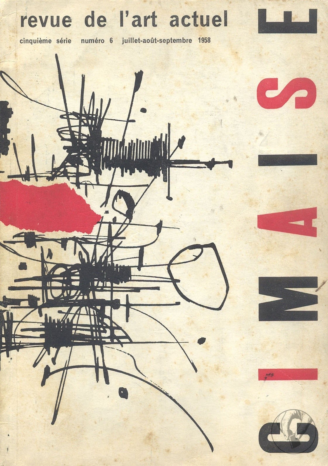
La revue "Cimaise" présente son numéro 6 de la cinquième série, couvrant les mois de juillet, août et septembre 1958. Ce numéro aborde les tendances actuelles de l'art, avec des articles sur la Biennale de Venise, des expositions à Paris, et des analyses sur des artistes comme Estève, Bissier, et Tobey. Il inclut également des textes en anglais et des informations sur les expositions dans diverses galeries d'art en France et à l'étranger.