Page 1
revue de l'art actuel quatrième série numéro 3 janvier-février 1957 S A T E N E R O G
Premières pages de l'ouvrage, en accès libre.
revue de l'art actuel quatrième série numéro 3 janvier-février 1957 S A T E N E R O G
Galerie de France 3 rue du Faubourg-Saint-Honoré, Paris 8, Anjou 69-37 --- Jacobsen poupées février - mars --- Prassinos avril
Stedelijk Museum Schiedam, Pays-Bas --- Divergences 4 Anthoons, Barré, Bertrand, Corneille, Carrade, Citron, Coppel, Dahmen, Deyrolle, Downing, Dumitresco, Feito, Fichet, Gauthier, Gilioli, Gillet, Goebel, Guitet, Istrati, Kaufmann, Kalinowski, Karskaya, Koenig, Lago, Laubiès, Moser, Pan, Panafieu, Pink, Stahly, Staritsky, Tanaka, Tryggvadottir, Van Haardt, Wessel février - mars --- Galleria del Fiore via Fiori Chiari 2, Milano --- Alva peintures récentes mars --- Galerie de l'Institut 6 rue de Seine, Paris 6, Odéon 32-90 --- Georges Hugnet planches et cailloux 1955-56 22 février - 12 mars --- Rétrospective internationale Dada 1916-1922 du 15 mars au 11 avril A cette occasion paraîtra un ouvrage de G. Hugnet sur Dada préfacé par Tristan Tzara. --- Galerie Ariel 1 avenue de Messine, Paris 8, Carnot 13-09 Anthoons, Bissière, Carrey, Compard, Doucet, Gillet, Hartung, Maryan, Poliakoff --- Meltzer Gallery 38 West 57, New York paintings, drawings, sculpture, prints by : Alva, Huguette-Arthur Bertrand, Dorr Bothwell, Louis Bunce, Rhys Caparn, Madeleine Gekiere, Edward Landon, Rolf Nesch, P. Schaar U. S. agents for the Estate of Jankel Adler
Vient de paraître : l’Art Moral ou La Répétition punie par Julien Alvard avec un portrait moral de Marie-Antoinette par F. Benrath tirage limité XXI exemplaires numérotés avec un dessin original, 1800 frs 979 exemplaires numérotés, 700 frs en vente à la galerie Arnaud --- Diorama Via Roma 25, Mantoue, Italie Directeur : E. Genovesi Revue bimestrielle illustrée en couleurs Littérature, théâtre, cinéma, photographie, arts plastiques Abonnement un an: 2700 frs correspondants : France: A. Virduzzo, 40 rue de Lille, Paris 7 U.S.A.: A. Virduzzo, 4715 Corpentor Ave, Bronx 66 New-York, N.Y. --- Revue internationale d’art moderne QUADRUM 240 pages, 170 illustrations, 12 planches couleur, 16 pages en héliogravure, 1 dépliant, 1 fac-simili Publié par A.D.A.C. Palais des Beaux-Arts de Bruxelles Diffusion française, Paris le no 2 vient de paraître --- European art this month editor and publisher: James Fitzsimmons Froschaugasse 5, Zurich, Switzerland In European art this month you find - Factual accounts for recent and current exhibitions - News of event and personalities, auctions, salons, and prizes - An extensive check-list of art books - Descriptions of museum collections - A calendar of exhibitions in all parts of Europe European art this month appears ten times yearly. A one-year subscription costs 6 dollars or 2100 frs
aujourd'hui art et architecture Une grande revue d'art Chaque numéro 100 pages largement illustrées nombreuses quadrichromies, une planche couleur d'un des meilleurs artistes actuels Parmi les problèmes traités : - L'art abstrait constructif - L'intégration des arts dans l'architecture Le numéro 900 frs. Abonnement 1 an, 6 numéros: France 4.500 frs, Etranger 4.800 frs Aujourd'hui : 5 rue Bartholdi, Boulogne-sur-Seine Téléphone: Molitor 61-80 et 61-81 C.C.P. Paris 1519.97 --- XXe siècle cahiers d'art publiés sous la direction de Gualtieri di San Lazzaro Nouvelle série-no 8 (double) janvier 1957, prix 2500 Art et humour au XXe siècle 150 reproductions en noir, 8 quadrichromies, 4 pochoirs en couleurs par: Arp, Miro, Dubuffet Une lithographie originale en cinq couleurs par: Jean Miro Fernand Hazan, Editeur 35-37 rue de Seine, Paris 6 --- Collection Prisme 2 rue des Lyonnais, Paris 5, Port-Royal 66-32 Auguste Herbin par René Massat. Texte en français et en anglais, avec de nombreuses planches. Prix: 1000 frs Arp par Michel Seuphor, texte français et anglais et Will Grohmann, texte allemand 43 reproductions Prix: 1000 frs Béothy par Michel Seuphor. Texte en français, anglais et allemand. 40 reproductions. Prix 1000 frs Edgard Pillet par Julien Alvard. Texte en français et en anglais, avec de nombreuses planches. Prix: 600 frs
Cimaise revue de l'art actuel 34 rue du Four, Paris 6 Directeur: J.R. Arnaud Rédacteur en chef: Herta Wescher Secrétaire général: John Koenig Rédaction: J. Alvard, R.V. Gindertael, M. Ragon, P. Restany La rédaction reçoit sur rendez-vous Abonnement (6 numéros) 1.400 frs - Par avion: 2.800 frs 34, rue du Four, Paris 6, téléphone Littré 40-26 C.C.P. Paris 5542.39 Diffusion: Allemagne: Horst Beck, Hoedingen ueber Uberlingen, Bodensee PS ch A Karlsruhe (Bd) 43328 Argentine: Editorial Victor Leru, Cangallo 2233, Buenos-Aires Autriche: Arnulf Neuwirth, Paracelsusgasse 8, Vienne 3 Belgique: Jean Milo, 28 rue de l’Arbre Bénit, Bruxelles C.C.P. Jean Milo, Bruxelles 1591.50 Danemark: Meiners Kunstforlag, Peder Skramsgade 5, Copenhagen Grande-Bretagne: Alec Tiranti Ltd, 72 Charlotte Street, London W 1 Japon: Meiji-Shobo, Surugadai, Kanda Tokyo Norvège: J.W. Cappelen, Sortimentebokhandel, Oslo Suède: Eric H. Olson, Upplandsgatan 3, Stockholm, 10 23 77 Suisse: E. Genton, «L’Entr’actes», rue du Lion d’or 4, Lausanne, C.C.P. II 144-56 U.S.A.: Wittenborn and Co, 1018 Madison Ave, New-York 21 --- Sommaire Couverture d’Atlan Textes anglais 7 Atlan by Michel Ragon 8 The poem-object by Pierre Restany 9 Martin Barré by J.L. Thibault 10 Fichet by Herta Wescher Textes français 11 Atlan par Michel Ragon 18 Le poème-objet par Pierre Restany 24 Voyage en Allemagne par Herta Wescher 26 La réalité confirme la fiction par Michel Ragon 27 Informations 28 Martin Barré par J.L. Thibault 30 Fichet par Herta Wescher 32 Voyage en Italie par Pierre Restany 33 A propos du Premier Festival de l’Art d’avant-garde par Michel Ragon 35 Les expositions par Julien Alvard, R.V. Gindertael, Michel Ragon, Pierre Restany, J.A. Thwaites Dans notre prochain numéro: Une étude sur Pevsner par Julien Alvard Notes sur l’architecture par André Wogenscky Peinture et architecture par Michel Ragon Peintres et sculpteurs d’aujourd’hui: Guitet par Michel Ragon Vulliamy par R.V. Gindertael Et comme dans chaque numéro: actualité, informations, bibliographie
Translations of the main articles by J.-F. Koenig Atlan by Michel Ragon Many people have just re-discovered (and for most it was a discovery) Atlan’s painting. From the time when the Galerie Charpentier gave him a star rôle by confiding last year’s “Ecole de Paris” poster to him, and on to the show that will take place next summer in the Musée Grimaldi at Antibes, and including his shows at the Galerie Bing, and at the Palais des Beaux-Arts in Brussels, the road that he has so suddenly covered has placed Atlan again in the foreground of artistic news. All of this incites us to start by precising the when, where, and how of Atlan’s artistic beginnings. His first one-man show took place in December 1944, at the now-defunct Galerie Arc-en-Ciel. These early paintings showed us an expressionistic figuration with birds and personages, with, nonetheless, certain inventions of form. Since it has been related elsewhere that Atlan’s vocation came tardily, coming to painting after philosophy and poetry, it is thus not useless to reiterate the fact that this first show nonetheless took place when he was thirty-one years old. This is the age of most of today’s artists… when they begin to show us really valid works. For most of the one-man shows of artists younger than thirty are rather useless, and only encumber an already overburdened artistic activity. For in his figurative work of 1944, Atlan showed us already what was going to be the essential part of his procedure. His style became precise in the four or five non-figurative works that he hung at the Salon des Surindépendants of 1945. This Salon was memorable, for that matter, for on its walls were revealed Atlan, Hartung, Schneider and others—this new tendency of non-figurative art that is now in the process of becoming classic. In February 1945, Atlan had his second show at the Galerie Denise René. Certain people will find a touch of humor in the fact it was with Atlan that this gallery began showing abstract art. In 1946, Atlan worked with the lithographer, Mourlot, on a set of plates that were to illustrate Kafka’s Description of a Combat, and published by Maeght. The following year, in January 1947, the Galerie Maeght presented Atlan’s third one-man show, and organized, besides this, a show of his lithographs in the salons of the Hôtel du Pont-Royal (December 1947). Thus, ten years ago, Atlan experienced a success that is similar to the one that he enjoys today. Participating in the main group shows of the Galerie Maeght (“Le Noir est une Couleur”—December 1946, “Sur Quatre Murs”—April 1947, etc.), nothing allowed one to foresee the eclipse that followed during almost eight years. It is true that this situation wasn’t absolutely unique, since in the same period, no ensemble of Hartung, nor of Schneider or Soulages, was shown in Paris. But for Atlan, the eclipse was more radical, in the measure where he lost almost all of his supporters, and in that he refused to participate in an artistic activity where the triumph of the so-called geometric abstraction reigned, and in which he no longer had a place of his own. In advance of his time (since most of the young painters of today refer themselves before all to expressivity, lyricism, and matière), he was forced to wait for his period to catch up with him. If Atlan has regained his former success, it is because today his painting is in relation with what the small group of persons really interested in contemporary artists expects from its painters. Atlan was reproached during many years for not being an abstract painter. And during his recent show, this reproach was reiterated by a certain number of critics. This is evidently as absurd as seeing Mr. Claude-Roger Marx (who will go down in history as the prototype of the critic for whom the art of his time is uncomprehensible; joining in the Elysian Fields the immortal Albert Wolf, another art-critic of Figaro, Camille Mauclair, etc.), tax Hartung for not being a figurative painter. Atlan is a painter who must be placed above the notions of schools, systems, or groups. Nonetheless (and this is why we bring up the subject), he would not be the painter that he is, if abstract art had not existed. You have only to look at his expressionistic figurative paintings of 1941, in order to perceive that if rhythm makes up a part of his expression, and that certain imaginary forms and his way of triturating the paint are to be found in these paintings, however the present works of Atlan that have gone through the rolling-mill of abstraction, come forth with a much stronger expressivity, and an infinitely greater power of suggestion. The “informels” and the “tachists” who reproach Atlan for his “classicism” (as others reproach him for his “baroquism”) evidently ignore the fact that Atlan preceded them by many years in the dangerous domain of the seductions of matière and the sign. His paintings of 1945 are for this reason doubly meaningful. Atlan, however, never stood still. The same year, after the predominance given to matière, he gave prime importance to his graphism, and expressed a “floral” world, followed a year later with savage fauna. The imaginary “animals”, as much plants as animals, succeeded one another up until, and including 1948. Then came the Atlan that we know now. So it is that a retrospective show over the period of twelve to fifteen years of his work would show not only the very great diversity of his work and its varied directions, but also the permanence of these haunting memories and the same obsessions, that form a style. Atlan’s painting marks a true rupture from the occidental arts, be they traditional or modern. One must seek references to him outside of Europe. It is african art (the unexpected black or ocher forms, the violent and sober movement, the well-constructed Whole); assyrian art (the simplicity of the large compositions, the movement of the wild beast, ready to spring, but still immobile: that is to say, the tension of the “almost immobile”forms.) From Europe, one can nonetheless link Atlan’s art with etruscan or romanesque art. In the creation of a painting by Atlan, rhythm, the inventor of forms, is fundamental. He must be able to dispose freely of the surface, and stuggles with a matière that must not be either too facile nor too cumbersome, a surface too slick nor too rough, nor too slow to dry, nor too dry and thin. From this comes his need to use simultaneously, during the elaboration of the painting, a thick trail of paint squeezed directly from the tube, a wide, unexpected curve of charcoal, spots of color in pastel or chalk. Atlan attacks the problem of matière differently from other painters, because of his need of one that is close to both that of fresco- and oil-painting. His technique is as personal to him as his inventions of forms. “Some ‘admirable’ painters”, says Atlan, “Braque for example, succeed in magnificently balancing all of the harmonies of their painting, from the arabesque to matière, from color to light. To me, the real greatness is elsewhere.” “You mustn’t be afraid to hypertrophy the essential something of your painting, even to the detriment of the rest. With me, this essential something is rhythm. Not the superficial rhythm of the line, but rhythm as an inventor of forms; rhythm, to which a colored matter resists.” “Picasso, Léger, Soutine, all combine power and greatness, with the slightest fear of bad taste, or of a supposedly insufficient execution. They despise that which pleases easily.” “Rouault, Picasso, Léger, had no more fear than I to surround with black, when they insisted on underlining to an exaggerated degree certain forms, or to contrast them. Whereas many painters “color” their canvases after having drawn the forms, just as a vulgar filling-in with colors the areas that are left,
I often proceed from the spot of color, and only add the black much later.” Atlan was one of the first promoters in this revival of black, a color that was outlawed since impressionism. Didn’t he, for that matter, take part ten years ago at the Galerie Maeght, along side of Braque, Matisse, Rouault, Marchand, and Manessier, in the show that attracted much attention at the time because of its provocative title: “Black is a Color”. With Atlan, in fact, black really is a color, a permanent one among his different “periods”: red, blue, green, ocher... His thick paint is almost like the substance of the earth, in evolution since primordial times when, in the original humus, the living forms still were searching for their canonical laws. And it is strangely linked with signs as evocative as the genesis of creation, or the fusion of the mineral, vegetable or animal elements. One could dream up a whole fabulous bestiary from Atlan’s work, a complete mythology where the beings, plants, and animals of inconciliable species mix together. For in the primitive mythologies, the sirens are half-fish and half-woman, the dragons half-snake and half-bat, the centaurs half-man and half-bull, the sphynx half-woman and half-lioness. The “atlantes” take part in these mysteries. And also those of the creator’s imagination that invented the polyps, the sea-urchins, the corals, the sea-horses, the star-fish, the cactus, the tortoises, the medusas, the wood-caterpillars. But let’s not go astray; these are only the landmarks, only the pretexts for poetical stimulus that will give an insight into Atlan’s painting. Many years ago, Atlan expressed his ideas on the subject of “figurative” art, and explained why if he didn’t consider himself as an abstract painter, he nonetheless considered himself as a non-figurative painter. In an interview by Aimé Patri in Paru of May 1948, Atlan stated: > I think that one might say that in the same spirit where Mallarmé commended the poet to “leave the initiative to the words themselves”, the non-figurative painter is the one who should accept to leave the initiative to the forms, colors, and to light, without the support of a pre-established subject. Once this initial process is accepted, it is of little importance for the result to resemble something, or nothing known to us.” Primitiveness, exuberance, harshness, violence, passion, are the words that come to mind the most often when one speaks of Atlan’s work; one of the rare works of our time that has succeeded in finding a style of its own. Michel Ragon The poem-object The fruit of our Civilisation of the Image by Pierre Restany One can claim, and with reason, that our period has seen a new civilization come into being: that of the Image. What with photography, the cinema, television, the signboard—a whole gigantic enterprise of distribution of the image has invaded our daily life. Man, placed in contact with it, has modified his behaviour. He no longer has time to “think things out”. Thought, from now on, is too slow: today’s man no longer needs reasoning, nor the reconstitution of the internal structures of the idea. He wants to “grasp”, to understand things immediately. The image has developed a reflex mechanism inside of him that has immediate effects, rendering useless all logical commentary or translation of thought. The sign becomes the fundamental element of rapid perception, from which all intellectual relation is excluded. Poetry has also reduced the margin that it allows to the survival of the logical structures of expression. The revolution brought about by Rimbaud has been assimilated for a long while now. In the poet’s search for immediate communication, he has first tried to reduce to an extreme degree the succession of the different syntactical moments, in order to let the idea appear in the full plenitude of its richness. Then he suppressed them altogether, thus liberating completely the suggestive power of the word considered in itself as an elementary unit, capable by means of its specific resources, of an immediate and simultaneous transmission of a sensorial message. Finally, the integrity of the word itself was no long respected, and its explosion has augmented the already long list of its purely affective possibilities, through the double usage of the calligraphy of its characters, or through a division and a syllabic parturition leading to the shout-rhythm of certain lettrists. Modern typography gives very exact testimony on this evolution: Mallarmé in his Coup de Dés, tears the phrases apart and plants, one by one, the shreds. The typographical space in which the poem is set up, henceforth takes on its full value: zones of emotive tension thus appear—privileged areas—where the elements of communication harmonize. This notion of privileged areas assumes a special importance from now on: we will find it again in Apollinaire’s Calligrammes, the distant successors of the Rabelaisian Bottle and the greek technopaignia. It gives an internal coherence and an expressive force to the work: the hesitations and reserves manifested by the best of the international hellenists in regards to the figured-poems of Theocritus’ time come, for the most part, from the fact that the copyists have not respected the initial spatial relations in their transcriptions of the Syrinx, the Egg, or the Hachet. The verses of these famous pieces are written one under the other in so many straight orderly lines, and in this fashion are no more than formless jumbles. In order to clarify the demonstration, we must reconstitute the space that is necessary for each poem, thus precising the image that is composed by the verses. These spatial relations are absolutely decisive in Mallarmé’s case: by excluding all intelligible meaning, but respecting scrupulously the initial typography, Mr. Ernest Fraenkel has replaced the words of the Coup de Dés by bars of corresponding length and thickness. He has obtained truly abstract graphic compositions, that are balanced and coherent. Recently, still, a young french abstract painter illustrated with india ink, a copy of the Coup de Dés; the endeavour is interesting because of the unequalness of the results: for that matter, it ends up as a complete failure each time that the illustrator tried deliberately to violate the space of the poem and to break into the internal balance, in order to serve his own purposes. These graphic works, whatever their intrinsic plastic beauty may be, come as an overload on the essential web of the work, stamped as they are with a completely external aggressivity. In order to arrange this unbalanced state, a new equilibrium should have been found and consequently the typography such as it was conceived by the author should have been modified. On the other hand, he is completely successful in the pages where the graphic illustration instinctively has found the lines of force of the poem, underlining the rhythm. The arrangement of a literary space using the fundamental elements of the work of art is an enterprise of synthesis and communication: it is a blending of the two types of writing, taking place on the borderlines of their respective limits. What is important above all, is the common language that is brought into being at the crossroads of these two pathways: the poem-object is the common instrument of communication. It can be defined, in a general way, as the place where the painter and the poet meet, or more exactly as the space laid out in view of this encounter. It is not by chance that the dimensional limits of this place of encounter are close to those of the normal-sized modern poster; the poem-object gives us, in its own visual field, signs filled with a particular and concrete totality. It attests to its intentions of SHOCK, of immediate transmission to others, comparable, though in a different way, to the selling qualities of a commercial poster.
This synthesis between the elements of literary and plastic idioms can take place on different intelligible levels: this explains the complete autonomy of this form of expression, contrary to traditional figurative illustration, that in art history has only the place of a minor accessory to literature. The poem-object is the most simple and most supple of all the “useful objects” put to the service of poetry, the notion of a poem-object being refractory in itself to any limitative or restrictive definition. In all of my attempts in this medium, in the company of artists as fundamentally different as Brüning and Bellegarde, Bertini or Benrath, Parisot or Laubies, the procedure uniting the work has always corresponded to rhythmic exactions. It is on this level of synthesis that we have immediately found the atmosphere of communication: we have sought, in every case, to transmit to the reader a pregnant sign, rebellious to analysis, having a continuous rhythm—the most faithful echo possible of the coherence of a shared Emotion. The respective positions of the word and its graphic extensions—the line, the spot, the color—have been deliberate, and examined in the sense of this symbiotic existence, of this osmosis; ledgibility itself is considered as one of the factors of this coherence, shortening the elliptic curve of the typographical “situations”, clarifying the evidence of certain connexions and certain parallels. These rhythmic transmissions have nothing in common with Marcel Duchamp’s ready-mades, the direct ancestors of the surrealistic poem-objects, that are really, due to a deviation from their goal, kinds of “humor-distillers”. Other attempts, in different lines of research, have taken on an analytical aspect, to the point where everything has been split apart. Downing, in this way faithful to the spirit of the cubist or dada collages, considers the mechanical print-character (made by the process of mechanical reproduction, such as a press or a typewriter) as an esthetic element in itself. The “shattered” poems of Bryen, also completely defy being read logically. Hépérile éclaté is a suite of print-characters that have been distorted by means of a thick pane of fluted glass, rendering them illegible. These “ultra-letters” are the first experiments in the mechanical calligraphy of printing-characters. The machines for the fabrication of the unreadable have been invented: now comes the big revenge of the Unexpressable. Bryen constitutes in this respect a border-line case: for that matter, two principal attitudes allow a differentiation between the types of poem-objects—the tendency towards calligraphy, and the tendency towards illumination. The tendency towards calligraphy must be understood in its broadest sense: we have to do here with all of the experiments towards an esthetic distortion of the letter, and all of its plastic possibilities, independent from its logical meaning. But many poem-objects present themselves as truly abstract illuminations. They are a bit the modern equivalents of certain pages of the Great Irish Books of the Late Middle-Ages (the Books of Durrow, of Lindisfarne, of Kells). These works, that remain the closest to the typographical experiments inaugurated by Mallarmé, tend generally toward a rhythmic organization of the spatial areas of the poem, the illustration altering in no ways the fundamental conditions of ledgibility. The term poem-object that I have adopted, covers intentionally the wide field of explorations and experiments taking place under the sign of the Civilization of the Image.: situated at the very paroxysm of the expressible, they occupy a separate spot in this ideo-graphic current, old as the world itself, coming from the non-phonetic hieroglyphics of the High Egyptian Period, to the Irish Illuminations, and Far-Eastern calligraphy. Rising above the initial diversity of their constitutive elements, the poem-objects take on a new meaning of synthesis. Symbiosis of line and color, of the word and the line, and * See Cimaise N° 2, Série I, December 1953. rhythmic extensions of orthography: these signs that appear in this privileged space reproduce, in a joint imprint, the Instant of Shared Emotion. The essential gestures, of which they are the trace, determine the conditions of a new type of reading, setting off a series of affective mechanisms of synoptic perception. The numerous “encounters” taking place today between painters and poets will not contradict me on this point: the course of poetic communication, in constant transformation, is enriched here with a new and supplementary medium. Pierre Restany Martin Barré by Jacques-Louis Thibault While I was going up the stairs that lead to Barré’s studio in the rue des Saints-Pères, I asked myself if perhaps a dutch landscape, a port, of a concert of dodecaphonic music would not better prepare me for his painting than visiting him. But once the door was opened, I no longer hesitated: the ruled-out design of the flagging, the rafters, the mansarded wall, composed a sort of internal formula of the painter. From the window, the vista over the roof-tops and into the sky gave a depth to the ensemble. The furniture, all very low, gave an impression of intimacy, but only the easel rising above these immobile surfaces, only the easel with its double-shelved palette had the keys to the secret of this domestic charm. I let myself become impregnated with the shut-in atmosphere. I had been caught: the studio had a soul of its own. Barré didn’t always have a studio, although he has always been a painter. From the time when he graduated from the School of Fine-Arts in Nantes, he has always had the same persevering and thoughtful passion. In spite of having to live in a hotel, of illness, of working in a bookshop or as a house-painter, he worked for himself, and especially did many drawings. First figurative, then a tachist before the letter, then doing geometric abstraction, he tried everything, but controlled everything, and destroyed almost everything. Barré didn’t get lost during these ten years; through all of his experiments, he kept a few great models: Léger, Schlemmer, and especially Le Corbusier, of whom he admires the severity of the writings, and the sincerity of the pictorial work. So when his old friend, Michel Ragon, let him have his room, Barré was ready: from work on paper, then on plywood, and on to canvas, he found his way quickly. An original style of painting was born. What strikes you at first in this painting is the enormous importance of the empty spaces in relation to the full spaces. White dominates his palette; it is an even white in the first paintings, but soon after it becomes a more elaborated white. “From a smacking white to an unctuous one” (as Michel Ragon says) he avoids immobility; sometimes fluid, sometimes stationary, it can stiffen or thaw, animating the canvas with an interplay of transparencies, of reflections, of opacities. Opposite this clear light that is kindled, that reverberates, that dies away, a construction of verticals and obliques develops with the rigour of a demonstration of a geometry filled with rectangles, trapezoids, and scalenes. But Barré is not the poor man’s Mondrian; his brown forms are not only purified by the neighboring limpidity, but are deeply and intimately penetrated by it, and it is this slow and reciprocal absorption, this subtle impregnation of the two elements, that constitute the most personal side of his art. And especially its sounds, for here the eye listens. A strange music, all in counterpoint, where the themes, scarcely set forth, fade away immediately; where the blues and reds, unceasingly held back by the scale of the whites, hardly dare to show themselves in a line or a form... it evokes the sonorities of percussion instruments, the resonance of chinese art. The colors do not sing, they vibrate.
Silence is made to take part in this musical composition whose forms seem continually to come into being, and then to fall apart, to pass from the solid state to a liquid state; the ochers that have escaped through inadvertency reveal the true subject of the paintings: the sea, or rather, a seaman’s way of mind, made up more from sympathy for the elements than interest in immediate circumstances, “less from joy in preparing the happening than in enjoying the phenomena”; but above all, the density of passing time, the consciousness of continuity, and of the present. It is the painting-of-fleeting-time, the painting «painted and powdered over actual time» as Julien Alvard likes to say, “the one that creates these forms that are constantly kept in check by mobility”. It is linked to today’s experiments, with the works of a whole new generation, but it has made use of a profound influence in order to fulfill itself: dutch painting. Bergotte died in order to see Vermeer; and today his small section of a yellow wall of a street in Delft, and the immaterial water that washes it, explains one of the most personal painters of our time. Jacques-Louis Thibault Pierre Fichet by Herta Wescher A well-bred young man, rather romantic, and a bit timid, or a frenetic dancer who delights in disguising himself in a burlesque manner; a correct silhouette, rather indifferent, in his french uniform, or very much at ease in pull-overs of fantastic colors, with restless and fiery eyes: of all of these images of Fichet, captured in the course of numerous encounters, which is the true one? When I saw him for the first time, I didn’t doubt an instant that I had an artist before me, but I wouldn’t have been able to say if he was a poet, a musician, or a painter. And perhaps I wasn’t too mistaken in supposing that in the end, all three are to be found in him. He certainly must have been devoted to poetry in his youth, and today still he is an untiring musician, even though his passion at the present time is more receptive than creative. Wonderful records, be they classical or jazz, accompany his during his work, and welcome you when you enter his ascetic apartment. Order reigns here, and each thing has its place. The furniture is reduced to the strict minimum, and on the light-colored walls are hung several works of his favorite painter-friends. The only de luxe objects are the expensive record-player, and a lamp-stand with all sorts of spots that insure him just the right kind of lighting for his painting. Then suddenly you discover a surprising heap of boxes full of screws, wheels, and rods, that remind you that Fichet the mechanic must also be taken into consideration. It’s important to know that he spends a good deal of his time in executing complicated constructions of «Meccano», and that the owns an astounding collection of «Dinky-Toys», that includes the most varied types of models of racing-cars, and ordinary automobiles, trucks, tractors, and busses. A good selection of them is placed on the mantel-piece, while the others remain shut up in their little boxes piled up on the floor. But he is always ready to bring them out as soon as you show any interest in the subject, and you can notice him looking quite seriously at this big parking-lot, not as if the cars were toys, but considering them as the essential objects of his preoccupation. He will tell you that when he was small, he hesitated a long while between becoming a painter or a mechanic, and his first drawing, done when he was three, naturally was of a car. However, if you try to find an engineer’s way of thinking in his painting, you will have to give up. Certainly, his paintings show a rather pronounced sense of construction, that is to say that the balance of the constitutive elements is always solidly established. But this formal framework that backs up the compositions is nonetheless hidden in the interior of the paintings, without penetrating the surface in an active manner. The essence of this painting seems, on the contrary, to be opposed to any sort of calculation, and is based moreso on pure imagination, as if Fichet searched elsewhere for the place to use his technical inclinations, in order to leave the sacred realm of painting intact. Art isn’t of importance to him until it has gone through all of the experimental stages, and become an instrument of secret communications and messages. He considers the act of painting as equivalent to a religious cult, and it is in meditation that his pictorial visions take form. The Biblical themes that predominated in his early, figurative, period come back again in today’s abstract compositions; freed from the traditional iconographic dogmas, their mystical sense is diffused through the subtle reflections of light, and in the strange radiance of the colors. In coming from figuration to non-figuration, Fichet has in no way abandoned the idea of a particular theme that can be expressed in each valid painting, and he works towards the slow and conscious elaboration of these themes. He begins with spontaneous drawings, that he transposes onto the canvas simply as a point of departure; he prefers the larger formats that allow him more liberty for the full development of his means of expression. Fichet always has several canvases around him, on which he is working, and with which he keeps constantly in contact, waiting for just the right moment to come to lead him up to the finishing touches. It is in the course of his work that the image takes form, becoming more precise at each stage. The compositions are based on rather geometric plane areas that Fichet impregnates with impastos and colors in order to change them into sonorous building-stones. He groups them, opposes them, combines them or disperses them, in a prudent game. Often these plans areas fall open, giving us perspectives into nothingness, sometimes they link themselves together in order to frame a particular fragment of the universe. Certain associations are brought to mind, suggesting constellations or meteors, whose appearance is never definite. You can perceive a latent mutation in the multiple forms, a discreet movement, rising and falling in the vertical formats, a struggle between antinomic forces in the horizontal paintings—a struggle that often ends with the victory of light emerging from the shades. Fichet pursues his path towards an increasing liberation from all of his more rigid structures, towards a refinement of the tonal values, that in the end, have a telling effect on the resonant qualities of his painting. The contours are effaced more and more, and the bold colors give way to more delicate nuances. He puts his sharpened sensitivity into the service of a technical mastery, that forces him to weigh the slightest doses and to leave nothing to chance. In placing the thin layers of paint one over the other, he obtains effects of unusual transparency, thus creating a vague spatial atmosphere where the suggested relations are infinitely extended. Among the warm and luminous shades of color, white plays a decisive rôle: a curious factor of irreality, capable of enchanting the matière. It is changed into magic veils that hide the abyssms, and that protect the open wounds. If Fichet himself designates these whitenesses as cloths, he is thinking of Veronica’s cloth of the Holy-Face, and we find echoes here of the spiritual world from which the sources of Fichet’s art flow. Herta Wescher --- Vient de paraître Arp par Michel Seuphor et Will Grohmann Collection Prisme 2 rue des Lyonnais, Paris 5
Atlan par Michel Ragon On vient de redécouvrir (et pour beaucoup de découvrir) la peinture d'Atlan. De la Galerie Charpentier qui lui donna la vedette en 1955 en lui confiant la réalisation de l'affiche de l'exposition « Ecole de Paris », à l'exposition qui se tiendra l'été prochain au Musée Grimaldi d'Antibes, en passant par la Galerie Bing et les Beaux-Arts de Bruxelles, le chemin soudainement parcouru a placé Atlan au premier plan de l'actualité artistique. Ceci nous incite tout d'abord à préciser quand, où, et comment se sont faits les débuts d'Atlan. Sa première exposition se tint en décembre 1944 à la Galerie l’Arc-en-Ciel, aujourd'hui disparue. Ces premières peintures montraient une figuration expressionniste d'oiseaux et de personnages, avec, néanmoins, des inventions de formes. Comme on a parfois dit que Atlan avait eu une vocation tardive, venant à la peinture après la philosophie et la poésie, il n'est donc pas inutile de souligner que lors de cette première exposition le peintre avait trente et un ans. Cet âge est actuellement celui où la plupart des artistes font leurs débuts valables. La plupart des expositions personnelles d'artistes de moins de trente ans sont inutiles et ne font qu'encombrer une activité artistique accablante. Car dans sa figuration de 1944, Atlan montrait déjà ce qui allait être l'essentiel de sa démarche. Ce style se précisait dans les quatre ou cinq œuvres non-figuratives qu'il accrocha en 1945 au Salon des Surindépendants. Ce Salon des Surindépendants 1945 est d'ailleurs mémorable puisque c'est sur ses murs que se révéla avec Atlan, Hartung, Schneider, etc., la nouvelle tendance de l'art non-figuratif actuellement en passe de devenir classique. En février 1946, Atlan fit sa seconde exposition à la Galerie Denise-René. Certains apprendront sans doute avec humour que c'est avec Atlan que la Galerie Denise-René fit sa première exposition d'art abstrait. En 1946, Atlan travailla chez Mourlot à une suite de lithographies pour illustrer la « Description d'un combat », de Kafka, publié par Maeght. L'année suivante, en janvier 1947, la Galerie Maeght présentait la troisième exposition personnelle d'Atlan et organisait de plus une exposition de ses lithographies dans les Salons de l'Hôtel du Pont-Royal (décembre 47). Il y a dix ans, donc, Atlan connaissait un succès très voisin de celui dont il jouit actuellement. Participant aux groupes principaux de la Galerie Maeght (« Le Noir est une couleur » (décembre 46), « Sur Quatre Murs » (avril 47), etc...) rien ne laissait prévoir l'éclipse qui suivit pendant presque huit années. Il est vrai que cette situation ne lui est pas absolument particulière puisque, pendant la même période, aucun ensemble de Hartung, ni de Schneider, ni de Soulages, ne nous furent montrés. Mais pour Atlan l'éclipse fut plus sévère dans la mesure où il perdit presque tous ses supporters, où
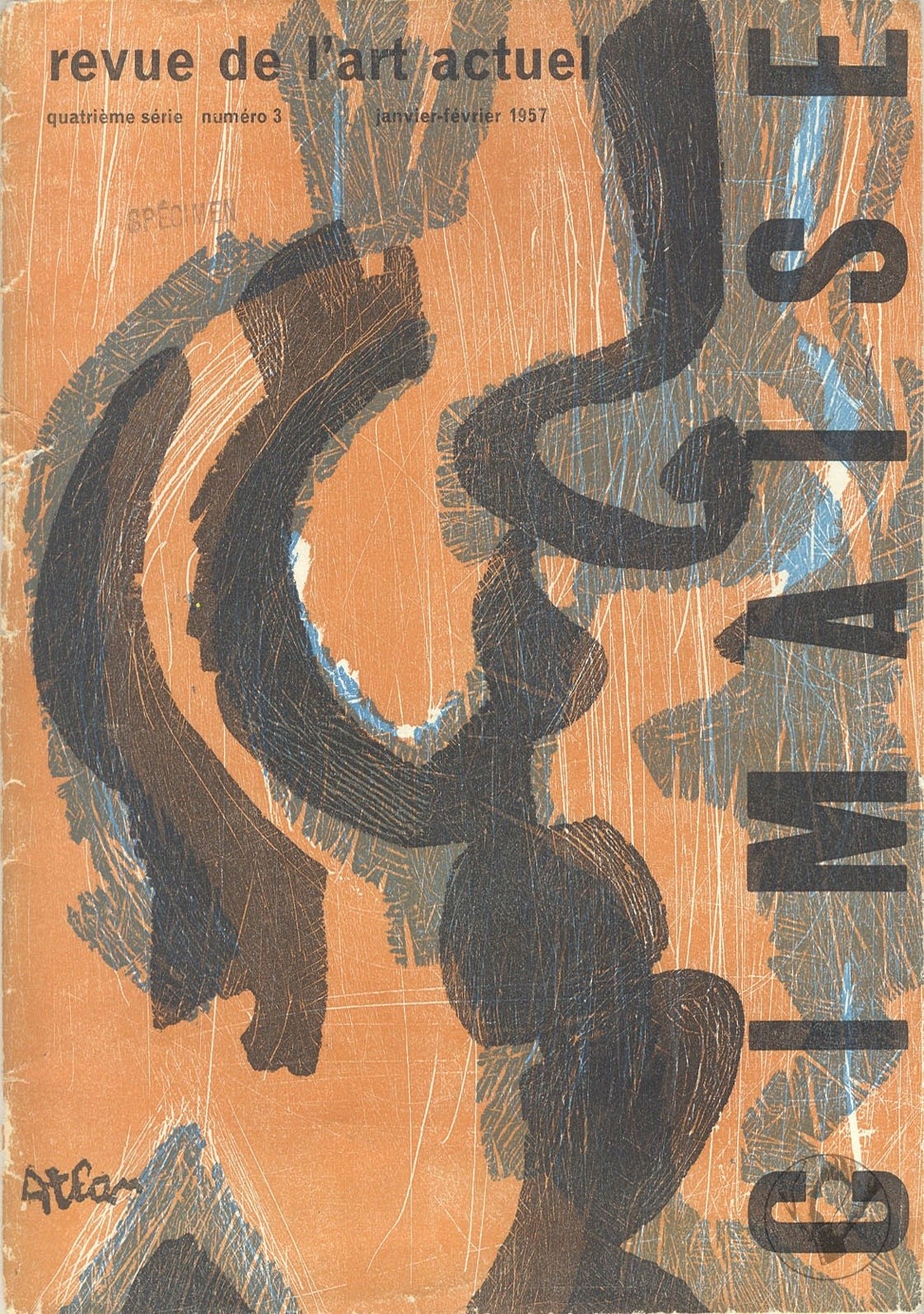
La revue "Cimaise" présente son numéro de janvier-février 1957, consacré à l'art actuel. Ce numéro inclut des articles sur les artistes Atlan, Martin Barré et Fichet, ainsi que des réflexions sur le "poème-objet" et l'art en Allemagne et en Italie. Il couvre également l'actualité des expositions et des informations sur le monde de l'art.